Brand

The brand, quietly.

A men's essentials brand built on thoughtful design, everyday comfort and construction that holds. The mark, the applications and the reasoning behind them.

Series 01 in development — concept imagery shown as design intent

Brand philosophy

Quiet strength. Built to last.

Good essentials don't need to shout. They need to fit well, feel right and stand up to everyday life. Brick by Brick brings thoughtful design and understated detail to the things you wear most.

02Subtle by design

Subtle by design.

Every detail has a purpose. Our signature mark is integrated into the essentials you wear most — understated, considered and built around the product.

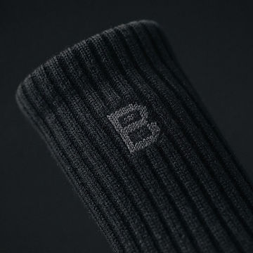
Extreme close-up of black ribbed crew sock fabric with the geometric B knitted into the outer ankle in tonal charcoal yarn

Socks

Knitted-in tonal B on the outer ankle. Jacquard yarn, following the rib and the curve of the cuff.

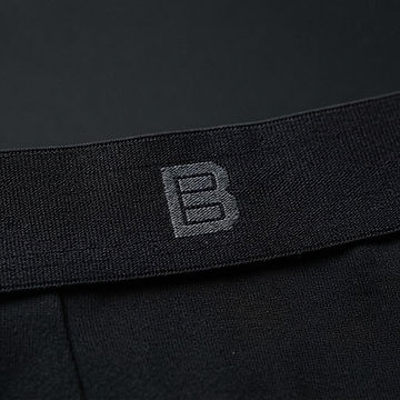
Extreme close-up of a black woven elastic waistband with the geometric B woven into the centre

Underwear

Woven into the centre of the waistband. Jacquard elastic, so the mark stretches with the band.

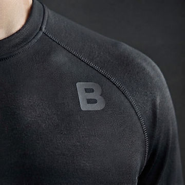
Extreme close-up of charcoal technical jersey with a small matte geometric B bonded onto the chest

Base layers

Small tonal mark printed and bonded at the chest. Matte, flush, absorbed into the knit.

Same artwork in every application. The geometry never changes — only the yarn, the finish and the scale. Socks are in development for Series 01; underwear and base layers remain concepts, not products.

03Fabric first

Construction you can see.

The mark only works because the cloth underneath it does. Rib, stitch density and seam finish are decided first; the branding is knitted, woven or bonded into that surface so it behaves like the fabric it sits on.

Macro photograph of a charcoal crew sock cuff showing the folded rib edge and fine vertical ribbing

Cuff rib

2×2 rib with elastic recovery, folded cleanly at the cuff. The structure the mark is worked into.

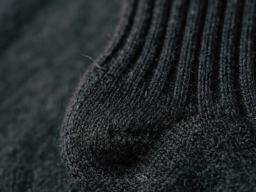
Macro photograph of a black knitted sock heel showing dense reinforcement stitching

Reinforced heel

Denser stitch at the heel for wear. You feel it long before you look at it.

04Colour and finish

The mark follows the fabric.

The finish should complement the product and the fabric rather than follow a one-size-fits-all branding rule. Five treatments cover the range, from almost invisible to deliberately clear — the geometry never changes.

Black on black

The most discreet option. Reads as texture before it reads as a mark.

Charcoal on black

A subtle contrast, picked up in raking light.

Stone on charcoal

A softer alternative for deeper fabric tones.

Dark on light

For bone, stone or light grey cloth: the same mark, inverted to sit darker than the fabric.

White mark

Reserved for selected applications where greater contrast is appropriate.

The palette

Ink

#111315

Charcoal

#24282C

Bone

#F1F0EB

Steel

#777D82

Ember

#D97732

04Product principles

What we build towards.

Four principles, not four claims. They describe the intent behind Series 01 — testing and certifications will be published only once they exist.

01

Fit

Built around a secure, considered fit — sized in clear bands rather than guesswork.

02

Comfort

Considered materials and construction for wear that lasts through the day.

03

Construction

Attention concentrated where wear happens, and where a garment quietly fails.

04

Everyday function

Nothing designed for a photograph. Everything designed to be worn repeatedly.

The founder
Brick by Brick monogram

Founder-led

Brick by Brick is built by one person, deliberately, starting with the foundations of clothing.

Series 01 — in development

No factory named, no certification claimed and no performance figures published until they are confirmed.

More than what you wear.
How you build.

Brick by Brick started with a simple thought: the things that matter most are built through the small things we do consistently.

I'm Andy, a husband and dad of two, building a men's essentials brand around dependable products and a belief in quiet strength.

This is a brand about getting the foundations right — in what you wear and in how you approach everyday life.


Our story
Brand assets

The files and rules behind every application.

Reference material: the master mark, placement by garment, colour and finish, type and social specification.

Usage rules

One shape, many treatments. Every application on this site derives from the same master file — no page holds its own version.

  • Use the supplied artwork exactly as provided. Do not redraw, stretch, rotate or recolour it.
  • Brand introduction, footer and marketing imagery use the mark at larger sizes.
  • Product applications stay small and tonal — favicons and social profiles use the mark alone.
  • Keep clear space around the mark equal to half its height.
  • Place the mark on flat ink, charcoal or bone only. No gradients, effects, shadows or outlines.
  • Ember orange is an accent for labels and rules — never a mark colour.

Placement by garment

Socks

Outer ankle, on the cuff, above the rib break.

Knitted or jacquard · 7% of frame

Boxer briefs

Dead centre of the waistband.

Woven or jacquard · 7% of frame

Base layers

Upper chest, or on the sleeve for long sleeves.

Subtle print · 6% of frame

System rules

proportions
Always the supplied artwork, at its own aspect ratio. Never squashed, stretched or redrawn.
clear Space
Keep clear space around the mark equal to half its own height on every side.
minimum Size
Never below 10 mm on a garment, or 16 px on screen.
contrast
Tonal first. Only use the white mark where the fabric genuinely needs it.
finishes
Knitted, jacquard and print shown here are design intent — not confirmed production specifications.
approval
Any new application must use MASTER_MARK. Never place a logo generated by an image model.

Imagery approval

  • One subject per photograph: a single garment or a single garment detail. No collages.
  • The mark is photographed as part of the cloth — knitted, woven or bonded. It is never overlaid on an image.
  • The geometry comes from the master file. A mark that cannot be shown accurately ships as an unbranded image instead.
  • Concept imagery shows intent. It is not proof of a manufactured sample.
06Typography

Display & headings

Archivo, 800

Uppercase, tight tracking, sparing.

Body

Inter, 400

Sentence case, generous line height.

Labels

JetBrains Mono, 500

Uppercase, 0.18em tracking.

07Social specifications

Five assets, one identity.

Profile image

Monogram only

Monogram centred on solid black. No wordmark, no tagline.

Use the monogram alone so it stays legible at avatar size.

1:1 — 1080 × 1080 px

Launch post

The foundations of clothing.

Monogram centred on black, with the line beneath.

Mark, headline, nothing else. Maximum negative space.

4:5 — 1080 × 1350 px

Founder introduction

Andy, founder.

Husband. Dad of two. Building the foundations of clothing.

A genuine portrait when one exists; otherwise a text-only plate.

4:5 — 1080 × 1350 px

Brand philosophy post

A good day starts by laying the first bricks.

Small things, done consistently.

Type-led on ink, single ember rule as the only accent.

4:5 — 1080 × 1350 px

Product development post

From concept to prototype.

An honest look at what we're working on, and what isn't finished yet.

Real development photography only — no renders presented as product.

4:5 — 1080 × 1350 px

Not permitted

  • Invented testimonials, reviews or follower counts.
  • Claims of testing or performance that haven't happened.
  • Bright colour, gradients or camouflage treatments.
  • Stock photography presented as the founder.
  • Oversized marks or slogans across garments.

The foundations of clothing.

Thoughtfully designed essentials. Quietly distinctive. Built for everyday wear.

See Series 01

Launch preview — orders open soon